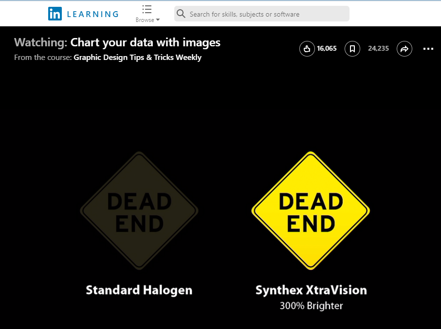
Today, we have a short LinkedIn Learning video that explains how to Chart Your Data with Images (2m 26s). The video suggests that you can use images to illustrate data in more compelling ways than simple bar charts or pie charts allow. The video is free with your VT login. Follow these instructions to login.
The requirements for your presentation state that your presentation graphics should meet these five characteristics (from Markel & Selber):
- It presents a clear, well-supported claim. (p. 587)
- It is easy to see. (p. 587)
- It is easy to read. (p. 588)
- It is simple. (p. 589)
- It is correct. (p. 589)
Compare these five characteristics to the advice that is included in the video, as you decide whether your images meet the five characteristics.