 Today’s post should be relatively obvious after all the readings on posters this week: A research poster can never be effective if it isn’t clear and readable. After all, if people cannot read what you have on the poster, it won’t hold their interest or attention. They may pass it by completely—and that is never a good thing.
To provide one more resource on good poster design strategies, I have “Putting It All Together” from the Poster Presentation collection at the WAC Clearinghouse. The page offers tips on font sizes and lettering, colors and white space, and general layout guidelines.
For a comment today, think about all the advice from this week and synthesize what you have read. Offer a tip, advice, or an observation.
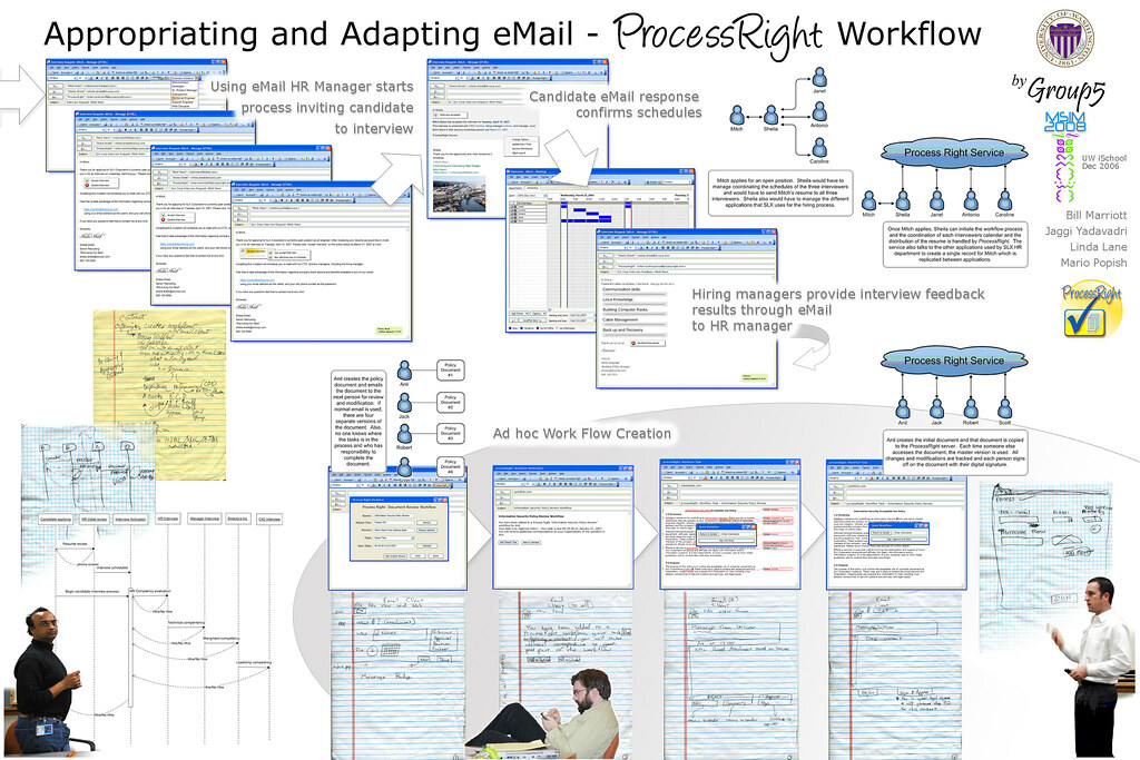
Photo credit: Software Design: Appropriating and Adapting eMail - ProcessRight Workflow Poster by Wonderlane on Flickr, used under public domain.